Authority Site Overhaul Case Study #5: Site Structure and Ad Positioning
Hi folks. This update we’ll be talking about two things that are pretty basic, but that many people get wrong pretty frequently.
If you haven’t been following along with the case study, here are all posts in order:
The First Post of the Case Study (Due Diligence and Validation)
The Second Post of the Case Study (Monetization Strategies)
The Third Post of the Case Study (Creating a Content Creation Framework)
The Fourth Post of the Case Study (How to Validate a Product)
The Fifth Post of the Case Study (Site Structure, Internal Linking and Ad Positioning)
The Sixth Post of the Case Study (Contributor Accounts)
The Seventh Post of the Case Study (Social Media Optimization)
The Eighth Post of the Case Study (Why Content Marketing is Tough)
(Password for all posts is NoHatDigital)
This update will be relatively brief as everything we’ve worked on is pretty straightforward – it took us only about a day’s worth of work to make all these changes, and it really only took that long because the theme that LearnU is built on is pretty rigid.
Site Structure
Generally speaking, there are two types of ‘users’ who will visit your site. Actual human beings, and robots. While there are a ton of resources that are dedicated to improving the user experience for humans, there aren’t a whole lot of resources that discuss how to optimize the ‘user experience’ for robots.
For the SEO minded, the most important ‘visitor’ that your site will ever have is Google’s crawler. In the vast majority of cases, no other user of a website has as large an impact on the success or failure of a website. Yet people are often willing to spend thousands of dollars and hundreds of man-hours on improving usability for humans, but few people give much thought towards how to improve usability for Google’s crawler.
Put into simple terms, the Googlebot’s goal when visiting a site is to amass all the information it can about a page, dump all that info into the Google index, and then move on to the next page by following a link. That’s essentially how Google works – it sends its little robots out into the internet, crawling each and every page that it can get its hands on, and dumps it all into a database.
Making your site easy to crawl makes life easier for Google – and in proper quid pro quo, they’ll make your life easier too. If your site has good site structure, you’ll be rewarded – your content will index faster, and in some cases your site will rank better as well.
If this is confusing, think of it in real life terms. Let’s say you own a hotel that gets inspected by a health and safety person every few months. On the one hand, it’s absolutely essential that your hotel looks nice and is comfortable for your guests, and that your standards meet their expectations. This is the design/human usability aspect of your site.
However, when the health and safety inspector comes and he needs to inspect each and every room, you want all the rooms to be easily accessible and you want the hotel to be easy to navigate.
While some portion of users might be happy with a hotel that’s oddly designed (weird architecture, a quaint lack of elevators, or other unusual, ‘creative’ designs), a safety inspector is definitely not going to care about any of that.
He just wants to do his job – his goal is to get around the hotel and visit all the rooms as quickly as possible to make sure that they’re compliant with safety regulations (the equivalent of Google’s Algo for on-page stuff like KW stuffing etc.) While he won’t fail your hotel just because there are no elevators and all the rooms are hard to access, chances are, he’ll be annoyed and this could negatively affect your overall health and safety score.
That was admittedly a rather tortured analogy, but hopefully it makes sense. Our goal is to make sure our rooms are easily accessible. In website terms, that means we want our pages to be easy to find.
So, how do we do it? To be honest, it’s really quite straightforward. Here’s a list of things that we did to improve site structure.
- Added all our categories to the nav bar
- Doubled the number of posts that show up in the category pages (from 10-20).
- Reorganized the categories a bit (removed categories that had just a few articles in them).
- Added a popular content section and a recent content section in the sidebar. We removed the Ads for LearnU’s books because the data shows that those Ads basically don’t convert at all – our Kindle sales are mainly driven by people searching organically in Amazon.
Here’s what the changes look like (I tried to keep the screenshots as small as possible while still demonstrating what changes were made).
Nav Bar Changes
Before:

After:

Doubled the Posts on Category Pages
Before:
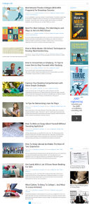
After:

Sidebar Changes
Before:

After:

Yup – that’s all we did. Our goal was to make it so that the Crawler would never have to go more than 3 pages deep to crawl any post or page on LearnU.
Internal Linking
This kind of falls under site structure, but it’s worthy of its own section. People often forget that one source of totally white hat links (as long as you don’t go overboard) that are completely under your control are internal links. Internal linking is a powerful tool that you have at your disposal to let Google know:
- Which of your posts or pages you consider the most important
- How the content on your site is relevant to other content on your site.
Also, it’s worth noting that while ‘related post’ plugins aren’t necessarily bad, it’s very likely that Google recognizes these kinds of links and doesn’t weigh them that heavily. If you really want to up your internal linking game, you should be inserting in-content internal links manually on pages and posts where you feel there’s sufficient relevancy.
Now, this is pretty straightforward if your site has 20 pages or so. But how do we do this if we’re working on a larger site?
LearnU currently has 516 posts published – that’s a heckuva lot of content to re-read and manually insert relevant links into. While it’s certainly possible to do it yourself, what we plan to do is create a process to systemize internal linking, and then outsource it to VAs.
It’s pretty straightforward really, provided you have a somewhat competent VA on hand. What you need to do is export the titles and categories of all your WordPress posts to a spreadsheet. You can use the Export to XML / CSV plugin to do this – it’s extremely straightforward.You should end up with a spreadsheet that looks something like this.
You then organize the data so that you have the same data in the top two rows and the two leftmost columns. If your categories aren’t really relevant to each other, you can choose to do this category by category and split the data up. For the sake of this example, I didn’t do so.
You then get your VA to go through each column (post title), and run down the rows to see which other articles could link the target article. Mark the ones that make sense with an X.
It’ll look something like this (note that I deleted a bunch of the rows/columns because Google sheets was being pretty slow).
So in this case, potential posts that could link to “How to Become a Dolphin Trainer & Why It’s a Great Job” would include:
- Looking for a Job? Join a Club…Literally
- How to Become a Horse Trainer: Salary, Career & Education Info
- How to Become a Veterinary Assistant: Job Description & School Requirements
- How to Become a Marine Biologist: Average Salary & Education Requirements
- How to Become a Zookeeper: Degrees, Schools & Career Info
Now it’s just a matter of inserting the links. In some cases, there might already be an appropriate place to insert the link. In most cases, you’ll have to add a sentence or two. If I wanted to add a link to “Looking for a Job? Join a Club…Literally”, I might add this sentence to the article:
Joining a club relevant to your preferred career choice makes a lot of sense. For example – if you’ve always aspired towards a career in Dolphin Training or something similar, you could boost your chances of getting a foot in the door by joining an animal rights club, or become a member of the Darling Cetaceans.
Once you’ve got the hang of it, you can train your VAs to complete this process – it doesn’t require a lot writing (pretty much just individual sentences), so you don’t have to worry too much about broken english.
Our own VAs are a little busy with another project right now, but we’ll be trying to get all our internal linking done on old articles over the next month or so. Our target is for most posts is to have 1 or 2 links pointing towards it. Our favorite, most in depth content on the LearnU will be getting more than that, and posts that are short and mainly news-based probably won’t be getting any links at all.
Note: If you’re still not bothered to do internal linking manually, you can use something like YARPP or Yuzo.
Adsense Optimization
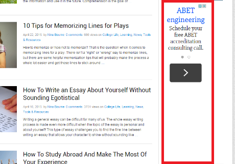
The previous Adsense blocks were placed as follows:
Large Rectangle, Top of Content, In-line.
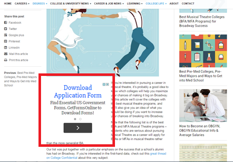
Bottom of Content, banner, centered.
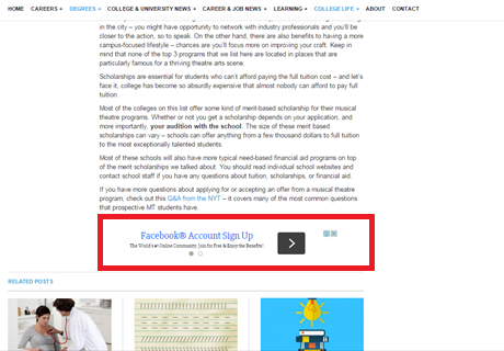
Skyscraper, sidebar
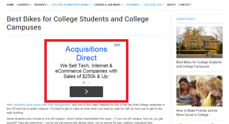
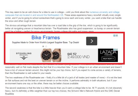
Our own experience with Adsense suggests that one specific Adsense layout tends to produce strong results regardless of what kind of site we’re working on. The layout is as follows:
- One large rectangular ad centered above content
- Two wide banner ads on top of each other mid content.
Remember, we’re implementing an 80/20 philosophy to LearnU, so we’re not going to be testing Adsense positioning a lot or monitoring the results obsessively – especially not at current traffic levels.
Here’s what the new adsense positioning looks like:
Additional Changes
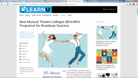
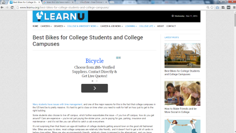
Another thing that we believe will boost Adsense CTR is the removal of Featured images from the top of posts – while they might look nice, they don’t serve any real purpose.
An additional design change that we’re making is to remove the left sidebar from posts – it doesn’t add anything, and it’s just a big chunk of wasted space. The content becomes much easier to read when this sidebar is removed. This probably won’t have any effect on Adsense CTR – it’s just a usability thing that we’re changing (mainly because the dual sidebars and the narrow area used for actual content was driving one of us crazy).
So posts will go from this, with featured image and left sidebar:
To this:
Conclusion
The stuff we discuss this week is all pretty straightforward – nothing super complex here – but we believe they can (and will) have a long term effect on the quality, traffic and profitability of the LearnU. The fact that they’re straightforward changes is all the more reason to implement them. In a lot of aspects of online business, the devil is in the details, and it’s important to remember that sometimes,it’s the doing the simple things well that makes all the difference.


Also worth to mention about interlinking.
First links in the beginning of the article will give more juice to internal pages.
Generally I prefer to add couple internal links in first 100-200 words and 1 link at the end of the article for people to keep clicking and browse through website.
Interesting idea, will keep this in mind.
TBH, with a site like this (with this much content), we won’t try and force the issue with internal links. We’ll put them in where they make sense topically, and not worry too much about exactly where on the page they are or stuff like anchors too much.
Can you explain further why you feel the featured images above posts don’t serve a purpose. I may not understand what you are referring to, but visual interest is usually touted as very important. Especially for young adults that this website targets. Wouldn’t visual appeal keep them on your site longer? That is what I am constantly being told anyway.
Hi Julia,
It depends on what your goals are from a site. Our goal in this case is to improve Adsense earnings, and in our experience if there’s a big featured image at the top of the page, it reduces adsense clicks.
On site time is only important if it relates to the earnings of the site, and as it stands right now it doesn’t matter that much.
In addition, I think that having anything above the fold that stops the user from getting the information that he/she wants is probably a bad thing. Visitors are looking for information – the featured image being at the top basically puts a small barrier between what the audience wants to see and the top of the page.
There’s also something to be said for the inflexibility of featured images – if I want to put an image at the top of the post, I still have that option. The featured image at the top forces me to do so, which is just less flexible. Just because we don’t have a featured image doesn’t mean that we’re not including images in our post, nor does it mean that our posts can’t be visually appealing if we want them to be.
Hopefully that answers your questions Julia – thanks for following along!
Interesting, what was the reasoning behind doubling the displayed posts on the category pages? Was this soley to get more link juice passed through?
It’s more just a crawl issue. The faster the googlebot can see your page, the better for your site. The deeper into the category pagination any particular post is, the less likely Google will pick up updates and/or changes.
This week was super helpful. The adsense optimization is something I know that we struggle with. Will you post in a couple weeks a before and after showing the impact of the changes?
Thanks for sharing your journey.
Great stuff men,
These are really significant changes indeed and i love the way you guys are treating this site, i don’t see the reason why it shouldn’t be a huge success with all these methods you’re applying on it.
Will be watching to see how the changes impacts the overall functionality of the site.
Thanks for sharing.
Removing the image at the beginning of the article. I was under the impression from a SEO standpoint that google likes a website to have media such as images (and there alt tags using keywords), videos, etc.
I guess you will have to see monitor your website traffic and ad clicks to see and which is in your best favor.
As far as linking to other articles on your site. I recommend using the search box, on your website.
After writing the article. Throw some terms taken from varies parts of the article and find out what articles show up. Go through a couple of them and if there’s a good fit. Link to it.
Google definitely likes media. However, the featured image at the top is kind of forcing the issue and hurts ad clicks.
If you look at our new posts, almost all of them have media in them – images or video embeds. Getting rid of the featured image at the top isn’t about shunning media, it’s about having more flexibility to place media where we feel it’s appropriate (and particularly in places where they’ll hurt adsense clicks less).
Hi there Hayden & George,
Thanks for the info about site structure and internal linking.
As for the rest, I agree with most of the changes but I feel that those two wide banner ads on top of each other will end up ‘killing’ each other out, at least that’s what my experience tells me (and a Google AdSense training seminar too).
Keep up the awesome work,
Louie
Our adsense placements pretty much come from anecdotal evidence (e.g our own experiences). Obviously the positioning right now could probably be improved with testing, but as it stands we feel we’ve 80/20ed the adsense placements – we’d only worry about serious testing once we’re generating significantly more in adsense revenue.
Having a main image for the post is good for shareability, as it appears with the shared link. Also, image count is supposed to matter for rankings… so I’m not sure about that adsense block up there guys, just my thought. It kills credibility and the sense of “seriousness” that you have achieved in the front page.
There is still a ‘featured image’, it just doesn’t show up at the top of the page anymore. As I mentioned in other comments below, we still have images in the body of the post where appropriate as well as other forms of media.
As for credibility, I agree with you in principle, but to be honest the site has a small audience right now and has no ‘credibility’ to begin with. If the site grows to a point where we’re getting a ton of visits (or have a very loyal following), then we’d probably change the ad positioning.
With regards to ad placement, I’m curious why other large sites do it completely different, and in many cases avoid any in content ads (example: http://blogs.webmd.com/webmd-interviews/2015/11/what-charlie-sheens-reveal-means-for-hiv.html)
Are huge sites like WebMD just not concerned with ad revenue? Or are they making even more with only above content and sidebar ads? Thoughts?
Larger sites tend to worry about branding basically. My guess is they have data that shows that direct visits/branded searches are hurt by more aggressive ad placements, which balances out the CTR difference (this is purely speculation on my part). In our case, LearnU isn’t really a ‘brand’ – it’s mainly deriving traffic from search.
There’s certainly an argument to be made that in the long run, the site would benefit in terms of social media and general ‘branding’ if the ads were less aggressive, but for now I think it’s fair to say that we’re not really near that point.
Here’s an example of a huge site that has ads above the fold (although they’re not adsense ads)
http://mediatakeout.com/288200/mto-world-super-exclusive-jay-z-allegedly-puts-hands-on-pharrell-blacks-his-eye-for-tidal-diss9pics-of-pharrells-face.html
[…] The Fifth Post of the Case Study (Site Structure, Internal Linking and Ad Positioning) […]
[…] The Fifth Post of the Case Study (Site Structure, Internal Linking and Ad Positioning) […]